
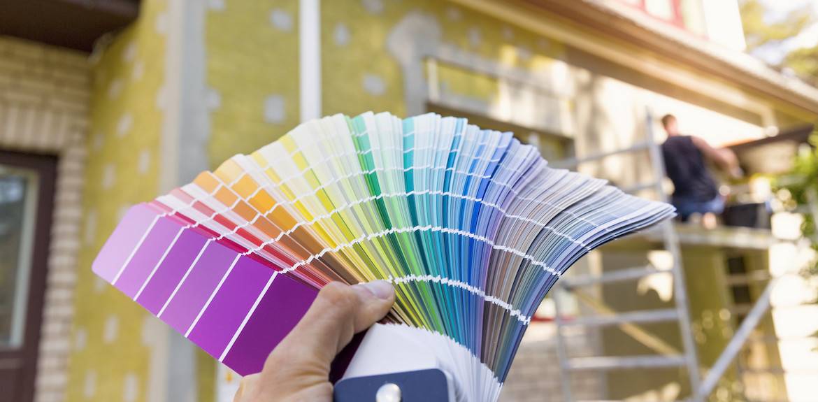
Pop of Pantone: Decorate With 2021’s Colors of the Year
Pantone, the company known worldwide for color expertise, released an annual color of the year (or colors of the year in 2021). In addition to helping companies like designers and manufacturers to define and control color, Pantone’s color guides and documentation help regular homeowners to pick a style that fits with their own sense of decor. This year, Pantone released “joint colors” for just the second time, in their colors of the year for 2021. (The last time colors of the year come in pairs was in 2016 with Rose Quartz and Serenity.)
So let’s get right down to it. What are 2021’s Pantone colors of the year?
Discover: Ultimate Gray and Illuminating.
According to Pantone, the message of these shades is of strength and positivity. In this pair of hues, Pantone aimed to encapsulate hopefulness, energy, and clarity, a fresh look after a tough and uncertain year in 2020. Sounds nice, no?
Well, iIf you’re interested in adding a dash of positivity to your home’s decor, Ultimate Gray and Illuminating are a great option. For some interesting and effective ways to use these colors throughout your house, read on!
On the Table
Yellow and gray are a popular color pair, and it’s easy to see why. Yellow’s vibrancy adds life and joy to the subtle, calming nature of gray, and each works well in small doses too.
Even without any paint, you can bring yellow into your home. Real or artificial sunflowers, tulips and daffodils can add a happy touch to a living space. Even a decorative bowl of lemons on the table does the trick. Taking some inspiration from the Pantone colors of the year, try putting them in a gray vase or bowl for an eye-pleasing contrast.
In the Bathroom
Look, bathrooms aren’t the most exciting part of the house. Most folks have a lot more fun in the kitchen, family room… you name it, really. So how ‘bout some color to bring your bathroom to life? Especially in a small space, a pop of color can make a big difference and create the illusion of size and scale.
If you’re still unsure about the colors you want, whether that’s Pantone’s gray and yellow combo or something else, start small. Don’t go painting a full wall right away, just get a little decoration and see what you think!
For instance, you can display a combination of yellow and gray hand towels, a yellow shower curtain, gray bath mats. It adds that wow factor while being temporary — ie. low or no commitment. When you’re tired of the combination, change them out. This strategy is perfect when changing decor for each season or just on a whim, and it works particularly well with neutral wall paint as a backdrop.
In the Bedroom
A bedroom should be comforting and calm, whether it’s a huge primary suite with a balcony and fireplace, or just a smaller spot to sleep. For an added touch of happy energy when you wake up in the morning, try incorporating yellow throughout the bedroom. A subtle, less-flashy yellow can even be nice as sheets or wall colors.
For a dose of calm, Ultimate Gray is the ticket. More modern looks are also available in darker shades of gray, like sleek charcoal and steel.
In Furniture
Go big or go home, right? Bright yellow chairs love to stand out and offer a super cute and vintage vibe. On the flip side, a charcoal gray lamp adds a bit of modern bite to your design.
If you’re daring, how about a yellow sofa? A statement piece like this can serve as a focal point in the living room or a nice addition to a large bedroom. Find a contrasting gray designer wallpaper as an accent wall, or gray curtains to balance the brightness.
As Art
Perhaps the easiest, tried-and-true method of adding color to your home is art. Posters, paintings, photos, sculpture and more can all add interest without being overwhelming (and being easily interchangeable).
If you are a budding artist yourself, try creating a gallery wall of alternating yellow and gray DIY artwork. It’s a fun learning activity for kids and adults.
Your Front Door
There are two ways you can include Ultimate Gray and Illuminating for the front door. The simplest way is with a wreath, adding a dash of color on your home’s facade.
The other way is with paint. Be bold and paint your door yellow! And to mimic the Pantone-approved color pair for ultimate curb appeal, you can add some gray by switching out hardware like the handle and deadbolt lock.
Outdoor Space
To transform your outdoor living space, try a gray outdoor furniture set offset by yellow cushions and pillows. It’s a sure way to brighten a dreary deck or drab backyard.
Or, instead of investing in new outdoor furniture, you can decorate with colorful accessories like stools, lanterns and end tables. Candles are also an easy way to add yellow or gray without going overboard or breaking the bank!
In the Kitchen
We spend a lot of time in the kitchen, so making it a “happy place” is a top priority. If you’re up for taking a big leap, try painting your kitchen cabinets a cheery yellow! If that seems like too much, there are very colorful and easily applied peel-and-stick backsplash tiles that might be just right for your design.
If that all seems like too much work, you can add some colorful appliances, vases and kitchenware. Gray tea kettle? Meet yellow mixer. And don’t forget about towels! Textiles like dish towels and aprons are amazing opportunities to add color that is interchangeable any time.
In the Nursery
Blue and pink may be standard fare for a nursery, but in recent years new parents have expanded their vocabulary of baby-room color. As an added bonus, you can paint the room ahead of time when you’re not trying to match color with your new baby’s gender.
Pantone’s yellow/gray combo is an easy, soothing palette for both baby and parents to love. The gray is calming while yellow warms it up.
And, as your little one grows, you don’t have to worry about repainting or redecorating. It’s a color combination for all ages.
On the Floors
Whether it’s in the bedroom, living room, bathroom or kitchen, you can spruce up any area with a good rug or two. Expert designers even overlay area rugs for a bohemian, contrasting look.
Since we’re talking about contrast, did we mention Pantone’s yellow and gray? There’s an idea to instantly liven up a space.
On the Walls
When you think of design, you probably think of walls first: art, paint, wallpaper, paneling, moldings and more. There’s a huge variety of options for wall decor, allowing you to get extra creative with it to make a smaller feature wall or cover whole swaths of your home’s interior.
For an accent wall in a larger space, try fresh paint or wallpaper to add some visual contrast. Patterns and texture really heighten the appeal, whether that’s designer wallpaper, painted wood paneling, or a molded plastic art form that you buy and install. Tiles are also a way to add interest at a relatively low cost.
As Lights
Lighting truly makes the home, from natural light to your installed light fixtures. While it’s not so easy to knock out a wall to add a new window, installing new light fixtures can be a cheap and very effective way to bring light and contemporary design into a room all at once.
If you’re going with the gray and yellow look, you can try gray sconces flanking a headboard in the bedroom, and subtle, cheerful yellow sheets. In a dining room or kitchen, a pendant light on the wall can make a big difference too.
As Books
Now, books are primarily for reading, but displaying them on a shelf means they’re part of the scenery too. Got some empty bookshelf space? Head to a local used bookstore or thrift shop to find colorfully bound books that will enhance your shelves and the whole room.
Even if you’re not a big reader, books and candles are a classic adornment for shelves. Who knows… maybe you’ll even get around to reading the decorations.
As Small Details
Gray and yellow are a proven color pair, but it can still be easy to get carried away and end up with a weird-looking living room. The best way to go is to start small, and use bright, eye-catching color sparingly so the room is not overwhelmed.
Luckily, starting small is also the easiest thing to do! Just begin by adding in little colorful details like trinkets, pillows and throw blankets. See how you like the colors first, and reevaluate before you make bigger decisions.
Getting a Home Ready to Live in or Sell?
We hope this guide on decorating with Pantone Ultimate Gray and Illuminating has been a little bit of helpful fun. The truth is, when you decorate a home you own, the world is your oyster! It’s one of the many benefits of home ownership.
If you’re getting ready to sell your home, then you want to appeal to the broadest swath of potential, qualified and likely homebuyers. We’ve helped hundreds of Leesburg and Loudoun County home sellers to make the right staging and improvements that stay within budget and avoid leaving money on the table.
For more information on how the Garrell Group helps to get your home in top selling shape, please reach out any time to start the no-pressure conversation and discuss your options. We look forward to hearing from you!